Tuesday 27 December 2011

Preliminary Task Analysing the Cover

This is my final finished piece for the preliminary project. I have chosen the colour scheme because it is for all ages and gender so it is appealing to everyone. Also I have chosen the main picture to be a person because through my research the covers have all had a single person on them, I could have changed the background of this image to one colour so there would be a larger area for the text. Additionally, when I was trying to add different coloured text it would have been easier as some of the colours that I wanted to use didn't standout very well.    

 Text And Font
The heading for the magazine is clear and easy to read because the bold text and colour stands out from the background. However, the text down the left side of the page blends in with the background, especially when the d in Marlwood overlaps the white background. I should have changed this so either the background was darker or the text was a darker colour to standout more. I think by overlapping the pictures and text the space is used well.  This is because it leaves room for the main picture behind to be seen and by having them together it describes the picture better.I chose the text because I think it is clear and easily readable.

Colours
I think that the main picture has too many colours in it so it was difficult to find a colour for the text to standout. Also the reflection of the guitar makes it difficult to place text over it as the guitar is brown and the reflection is white.  Due to this, there is no colour you could put on it to make the text easily readable. Also the colours in the persons shirt has the same effect.

Placement of Images
There was not much space on the main image for other text and images to be put in because it was mainly taken up by the performer. So I chose the places that had small amounts of colour in them. Like having a certain picture over the performers hand, you can still see that he is playing the guitar, and a new space has been created. I also wanted to add the image of the school but it was difficult to find a suitable place.  When I did eventually add the image, I decided to add text above it which seemed to bring it together and it didn't seem out of place.

Improvements
I could have taken the corners off the other images on the magazine to make it smoother and flowed better. Also I could have made the person in the image look at the camera when I took it, so the subject would bring you more into the cover as if he were looking at you.  It would also show the ease that that the person playing the guitar. Additionally, I could have made some of the text different colours so it stood out better.  I could have also used less colours in the whole image as it would have given the magazine an overall colour scheme.  Finally, in the school image, I could crop the top and bottom, taking off some of the less interesting sky and grass - making the building more of the focal point.

Friday 9 December 2011

Preliminary Task

                          This is my Preliminary Task completed.

Thursday 8 December 2011

Double Page spread ideas

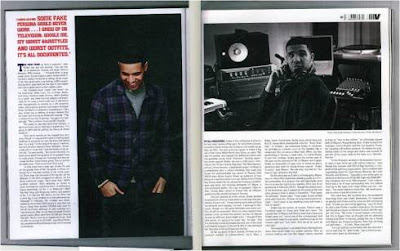
They have use a large amount of text when creating this double page spread. i would use less text that this and make the images bigger or only have one large picture. I like the way that they have put one image in black and white to make the other image stand out, so you can see who the picture is of. I think that the heading for this article is too small and it do not stand out so yo can see easily what the article is on. I would make the heading bigger so it covers the very top of the double page. They should have a main paragraph at the start of the article so it is a brief introduction into the main text, and they can easy decide if they what to carry on reading.
The areas that I would use for this magazine are

  • i may use the two images one in black and white and one colour to make them stand out.
  • the text on the left so if explains the image
  • Page numbers 

Double page for music magazine


The creator of this magazine has decided to use a large image that takes up a page and goes over to the other page. I like this idea but I would make the picture smaller so more writing can be put onto the page.

The heading is clear and i like the way that they have changed it so it is different, I might use this because it stands out. I could do this on Photoshop to ensure that it looked good. they have inserted three columns of text if I was to do this page i would add more text so there is more detail and it explains the image more. i would also use the page number which are in the bottom left and right corners so the reader knows what page there on. Also they have used a quote for the title so they can ensure that the article is relevant to the image and make the story description stronger.

Wednesday 7 December 2011

Content Page ideas

Content Page
I like the way that the contents page is set out there is a heading to show the reader what this page has on it. but it would use a larger and more complex title to make it stand out for the background and pictures.  
I also like the columes down the side that seperate the image for the writing. i might use this in my magazine because it makes it clear and easily readable. by using the large picture in around the centre of the page it allows the reader to see the what the main article is on in this addition of the magazine. When showing the page numbers it gives a large amount of detail into what is on the page, by show the title and a short peice of writing for the articles. They have added a reveiw area at the bottom of the page saying what pages the music charts and movie rates are on, i like this idea becasue it allow the reader to easily find the music types they are into, so they dont ahve to look all the way though to find there type of music. The colours of the background and sub-headings could be brighter because the page is not very involving and there is no area that catchs the eye or stands out.
For the content page for this magazine they have used a large picture to draw the reader eye to it so it is more involving and more enjoyable to read and look at. i like the way that they have set the magazine out by have a large image, with the smaller contents text to it. I may alos use the grey filter over the image with just a single colour so it stands out. I also like the way that the content title is set out becasue it is different and bold (it stands out). The background could be a little bright so the page is not as grey and dark. I would also make the writing a bit bigger so it is easlier ot read and clearer for the read to see.


Tuesday 6 December 2011

Analysing Music Magazines

they have used layering on this magazine so they can have different text and images in curtain areas. Over the image they have use text to show want is in the magazine, and by using different colours they have made areas standout to ensure that the customer can easily see what is in the todays issue. Also by using different text they make some text standout for the rest. They have then added a large amin picture to show the customers what the magazine is about (the main article). They have also added the piture so it is enviting of the customer to see and read. The Title is behind the person head so there face is showing and they can clearly be recognised. I would use this in my image becasue is allows the whole page to be filled and still have the main articles shwoing and the title still being seen. they have use banners of the magazine to advertise features in the magazine. I will also use the banner in my magazine because it make the text clear and the titles are easily readable. 

I will use...
  • I will be use the banner on my magazine so in makes areas stand out.
  • The title behind the main image so the whole image can be seen.
  • Different text and colours so the magazine is interesting for the reader.
  • Changing the size of the font so it is clear which areas are headings and sub-headings.
  • Single person in the piture so the magazine cover is clear and visable.

Monday 28 November 2011

Ben Farrell Media: Schools magazine picture ideas

Ben Farrell Media: Schools magazine picture ideas: I would use this picture to be on a side column of my magazine this because it shows the main sixth form block and it is a clear picture too ...

Schools magazine picture ideas

I would use this picture to be on a side column of my magazine this because it shows the main sixth form block and it is a clear picture to see the school facilities. I may have to change the contrast to make the colours stronger so it shows the school off better and have the buildings in the background in more details so the bin at the front doesn't get recognised and is not the centre of the picture.
this picture also show the facilities of the school and show student working hard on the computer. The picture also allows the veiwer to see the encoragment that the school gives the students to read. there is alot of colour in the picture so it is a good picture for young students, it envolves the kids in the magazine.

all of the pictures will have to be edited in some way so i can then fit them into the magazine. i my not use all the images in my magazine cover, but they give me an idea of the type of magazine i want to create.

school magazine cover - analysing ideas

This is the picture that I have chosen to use for the front cover of my school magazine. I have chosen this picture because a lot of the professional magazines have a single person in the picture. It also represents the school and with the other pictures around it as well it will be easily recognised as a school magazine. I may edit the background to a single colour so the person is the only focus. Here is a example of a professional magazine that I want mine to look similar to.
there is a clear picture of the main subject and writing heading around the outside saying the main stories in the magazine. I will also use the lots text around the outside so it takes up areas that would otherwise be blank.

I will also have this picture on the cover because it show the arts that go on in the school and will bright up the cover. I will have to change the contrast of the picture so the colours are bolder and may also make to crop the picture so it show just the artwork. I may also take the corners of the image so it makes magazine have no corners on the cover, I want to make the pictures blend into each other. 

Other images in other post.