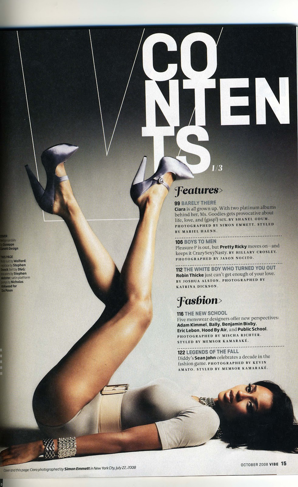
This is a a contents page that I have taken from the magazine "Vibe", it shows the features that are it the magazine and allows the reader to see the main artist. I have taken the idea of the way that the title is set out, by having it not in a straight line but having it offset. I liked this idea because it makes the contents page standout and all the text can be read. I have also used the layout of this magazine contents page so there is enough space for the people in the picture and the text.
I have come up with my own idea, for the way that the feature is set out. I have used the shapes tool on Photoshop so I can get all the numbers in the boxes, which allows the page numbers to standout so it is clear what is on the pages.
Improvements
- The background of the picture is a little dark so I can use Photoshop to change this.
- The colours of the title needs to be changed because it is a little dark.

No comments:
Post a Comment